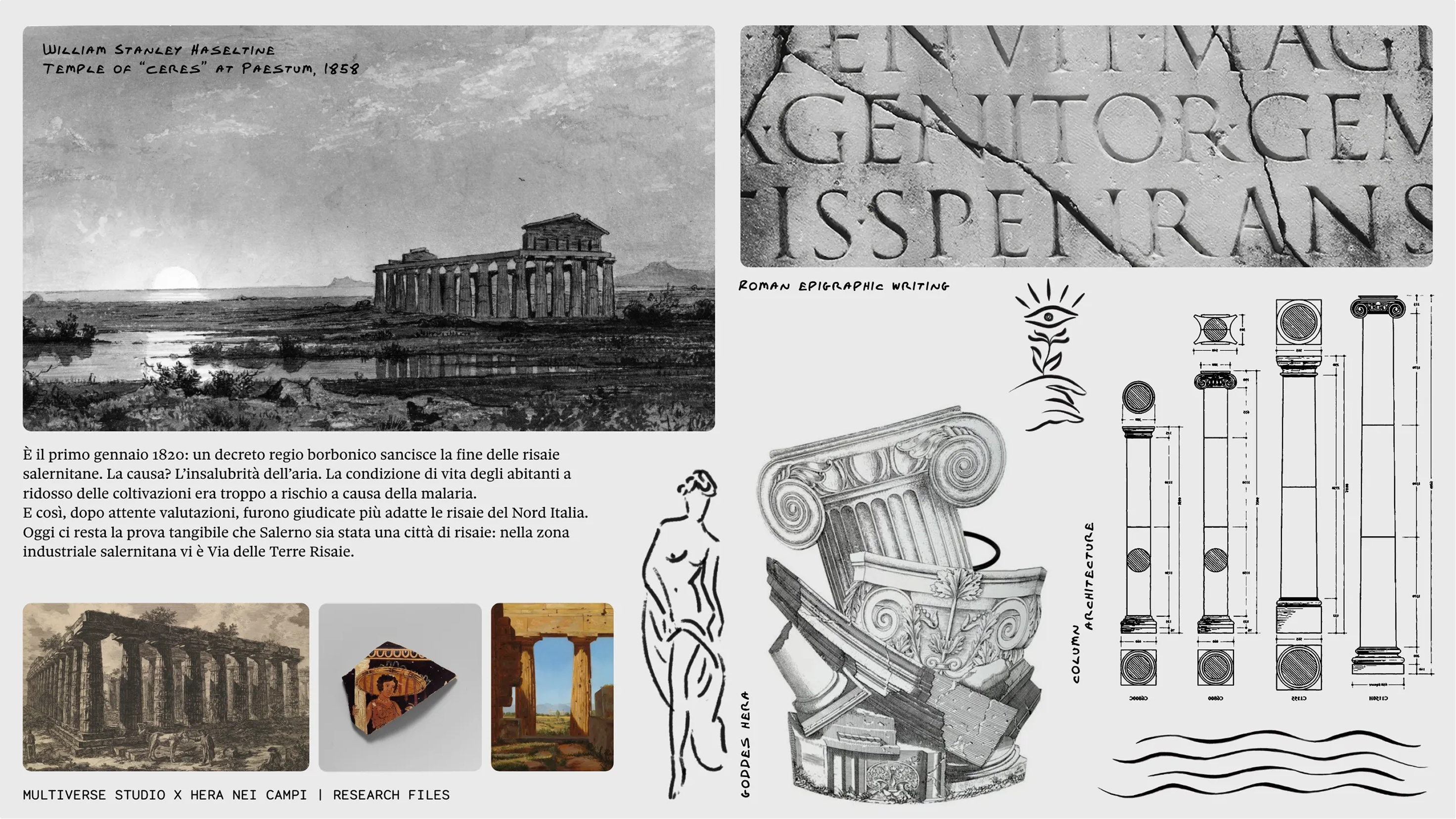
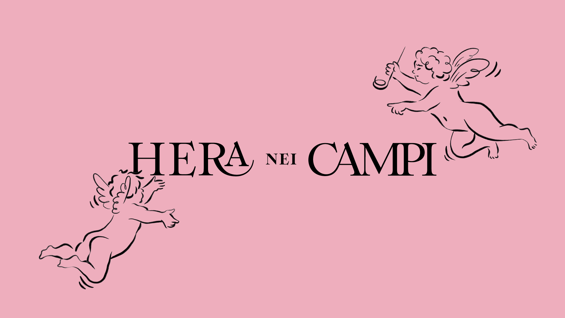
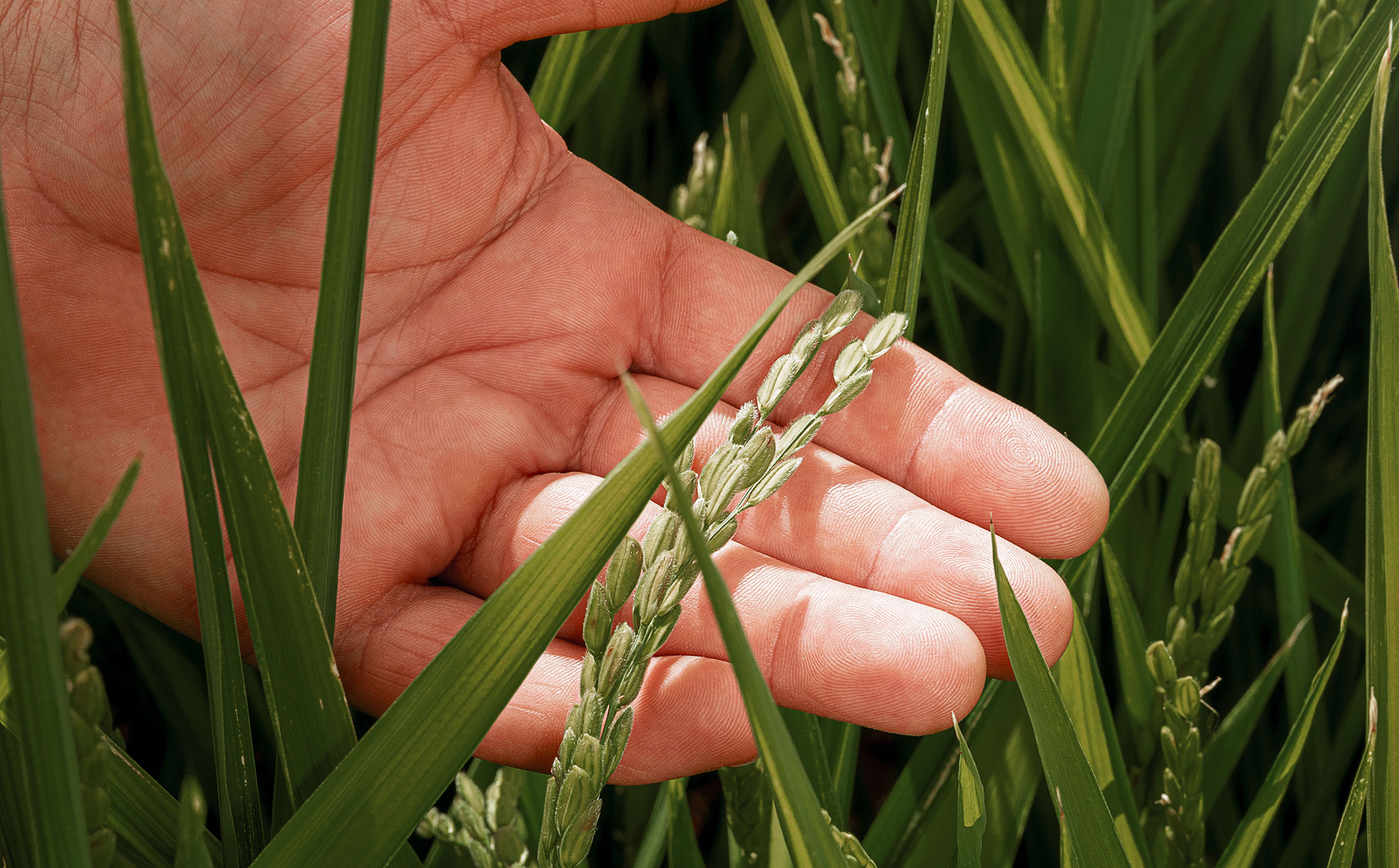
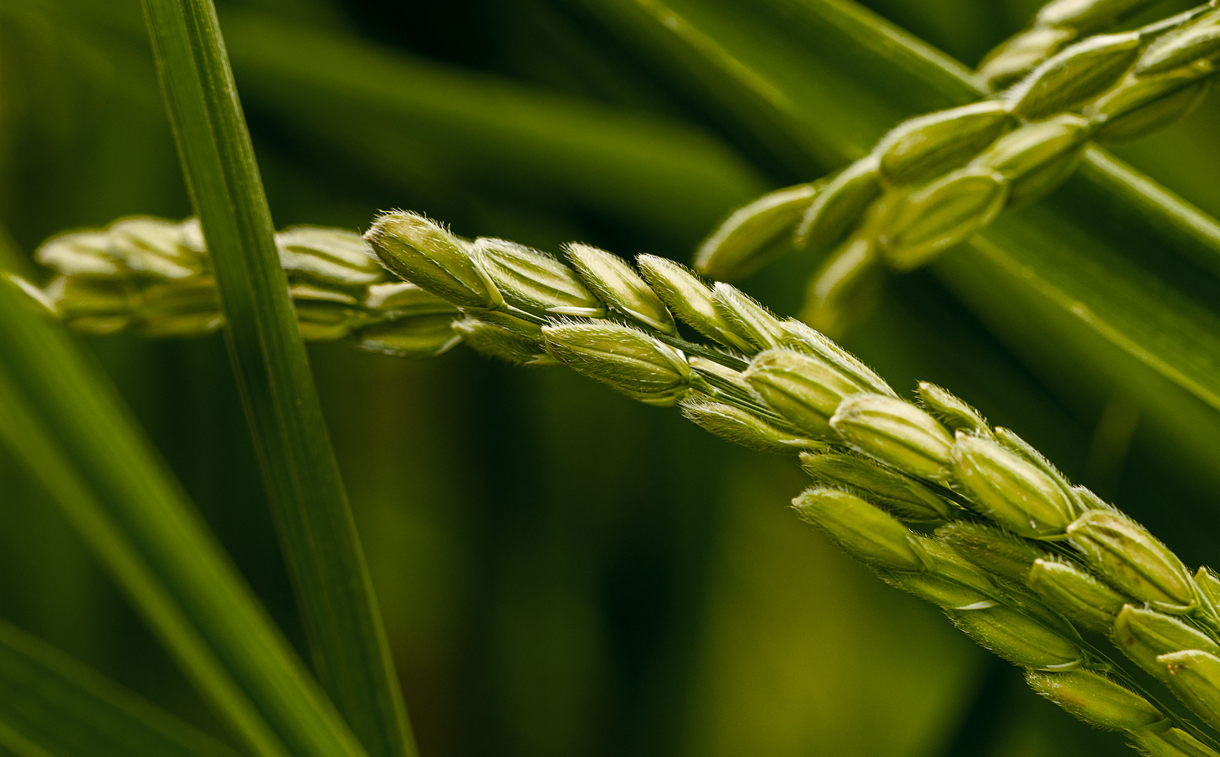
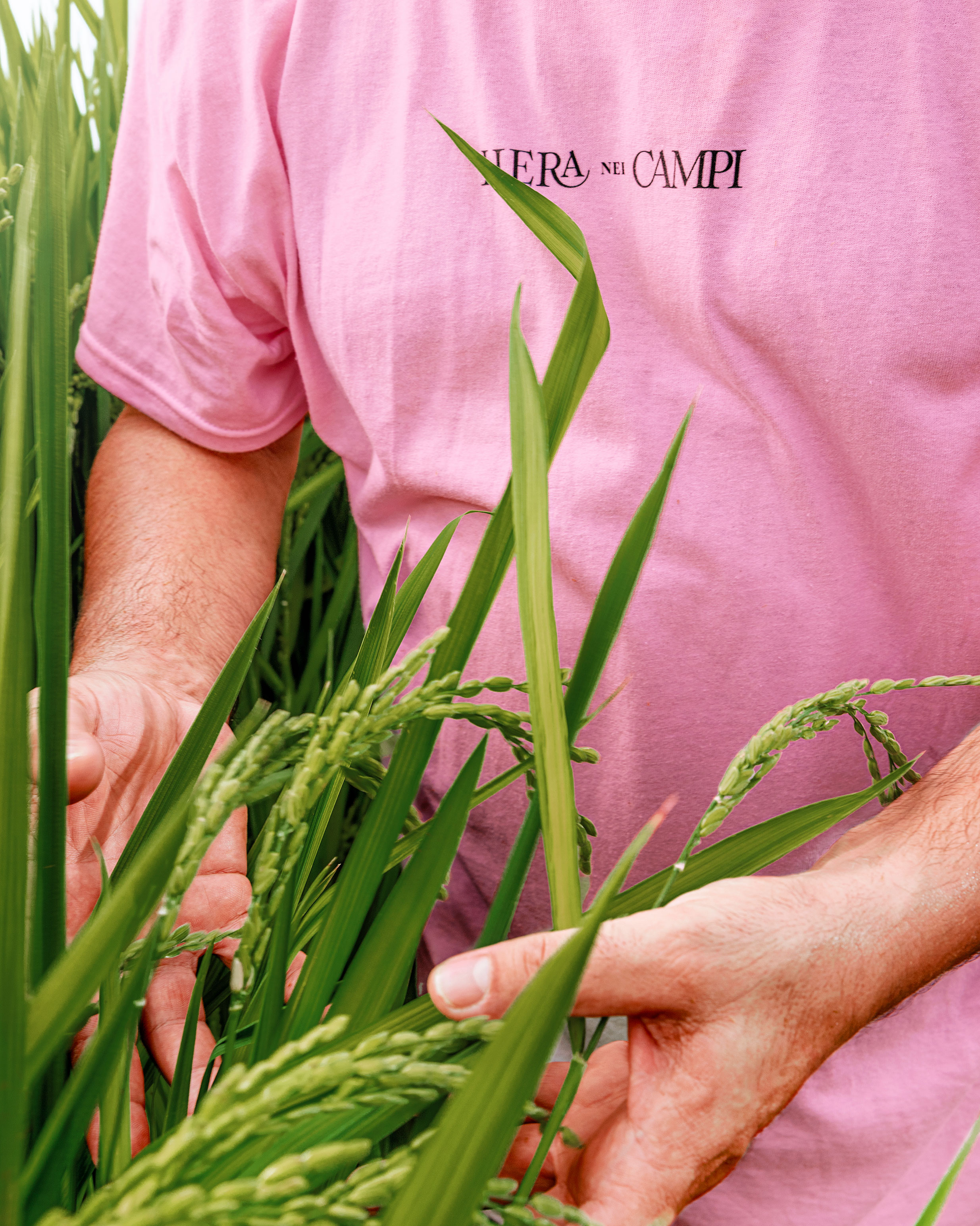
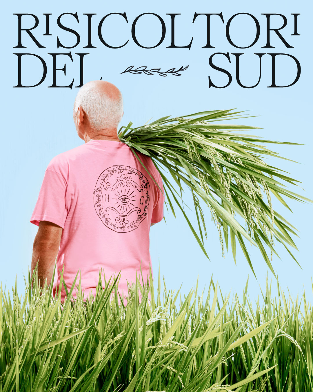
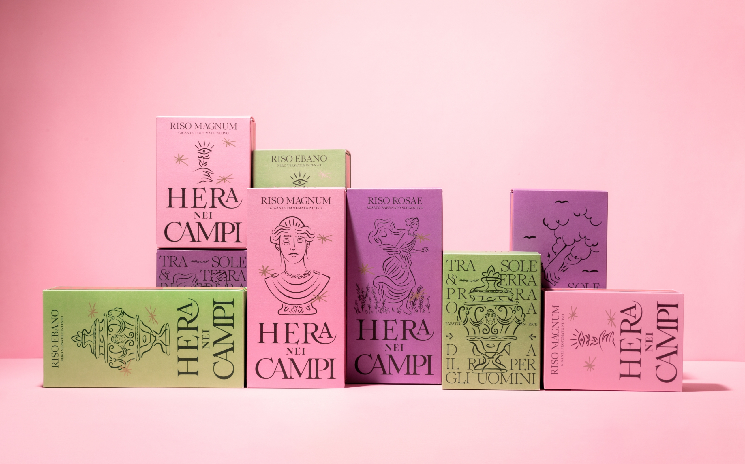
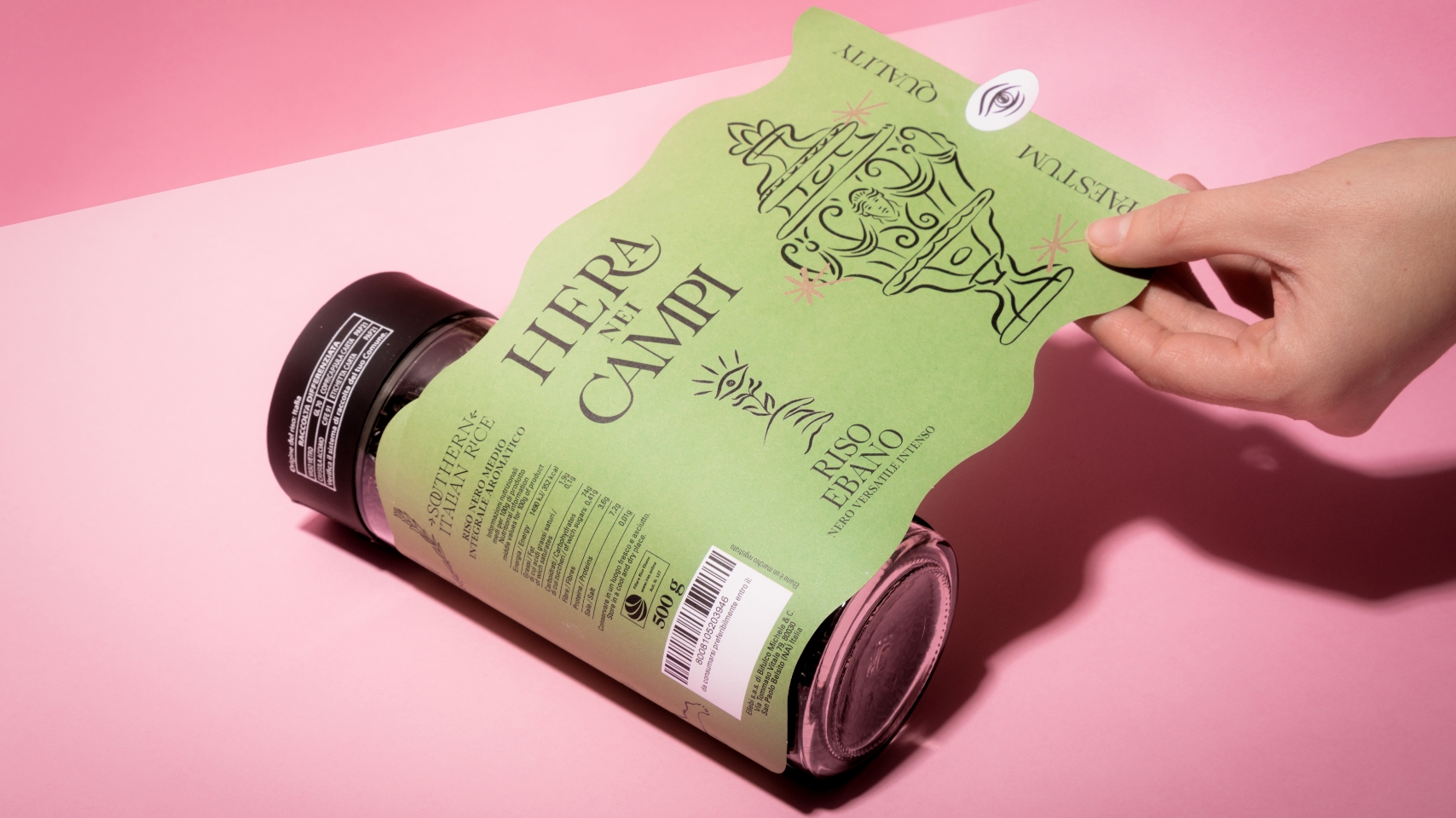
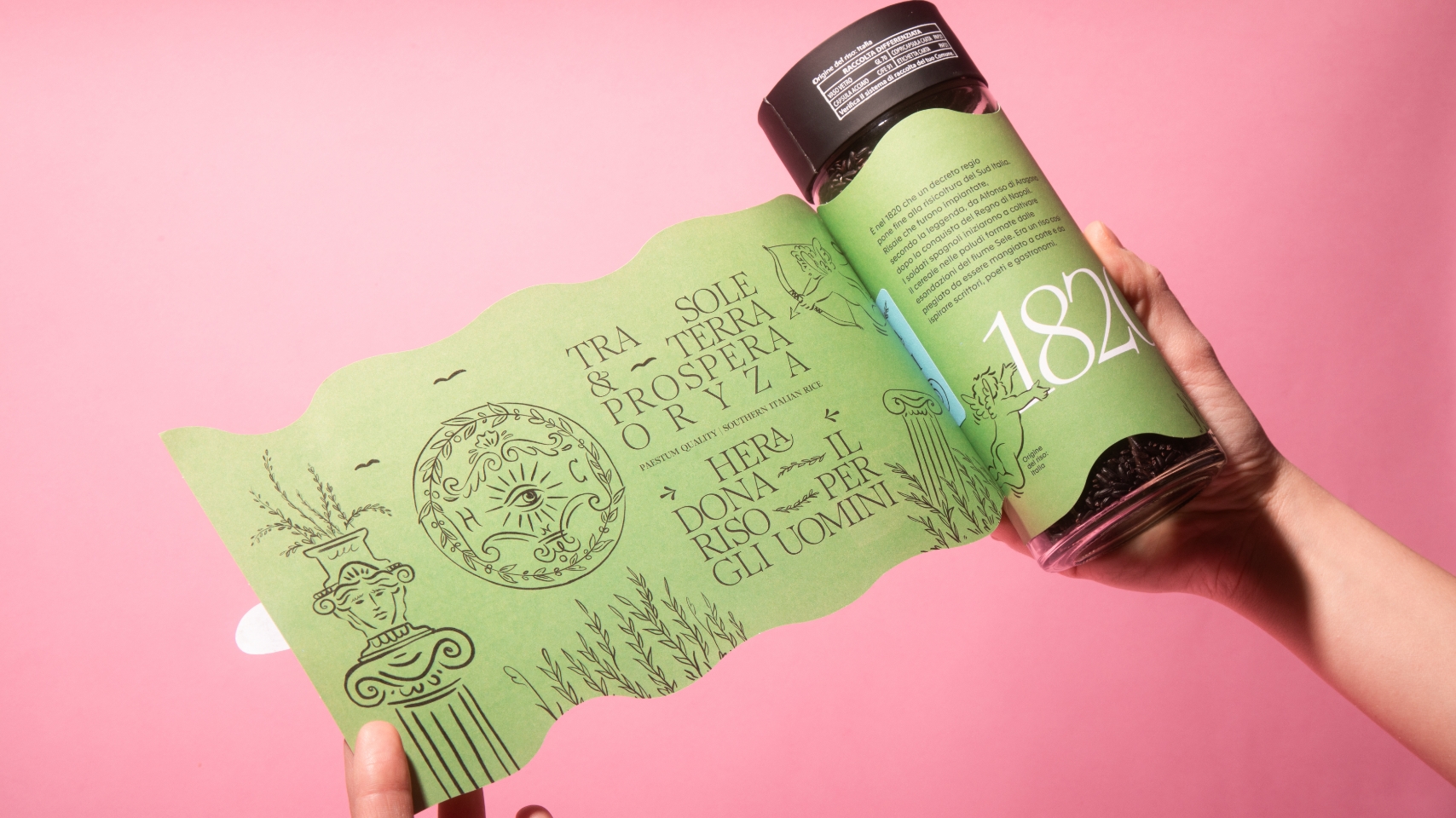
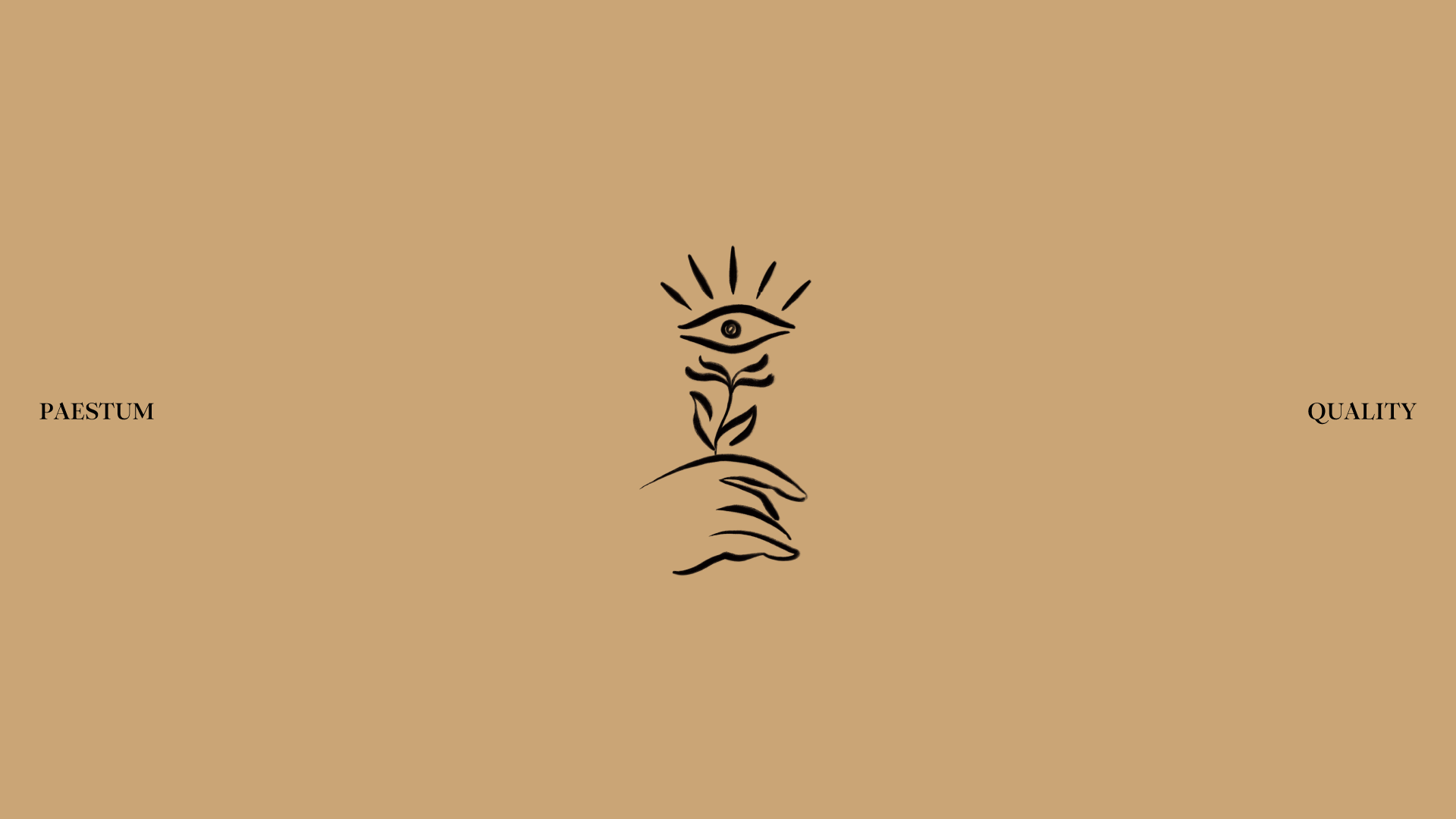
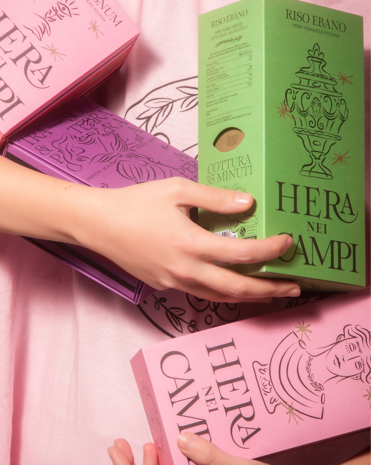
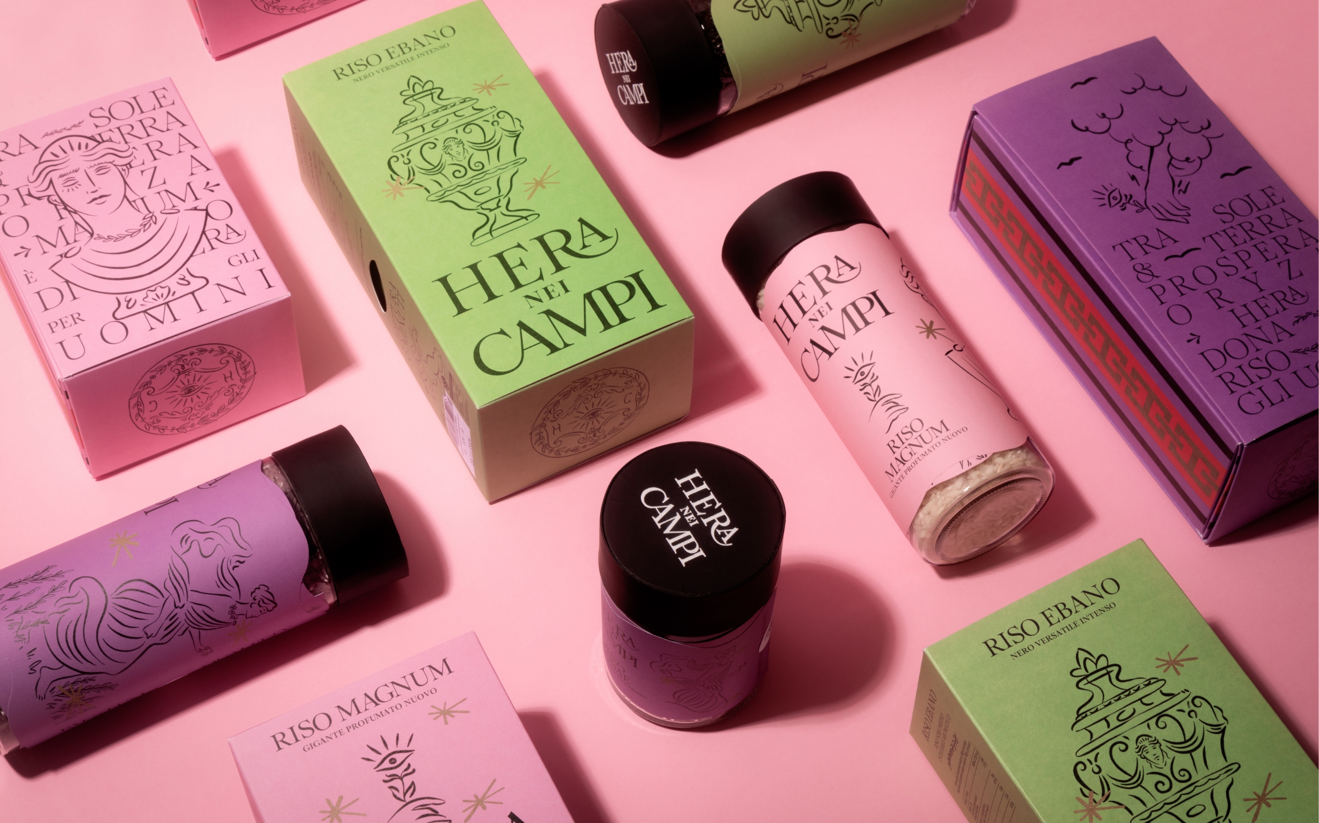
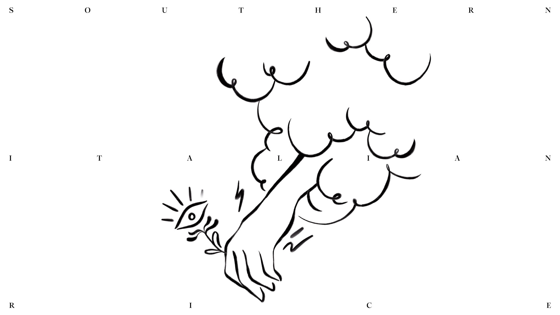
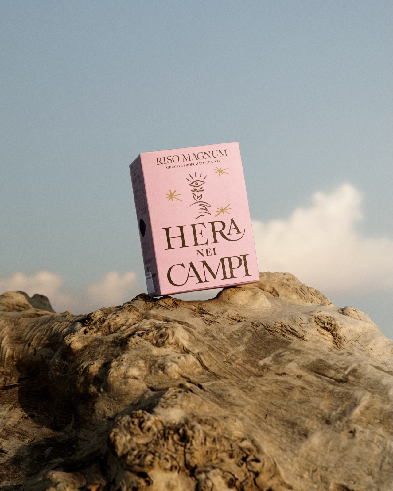
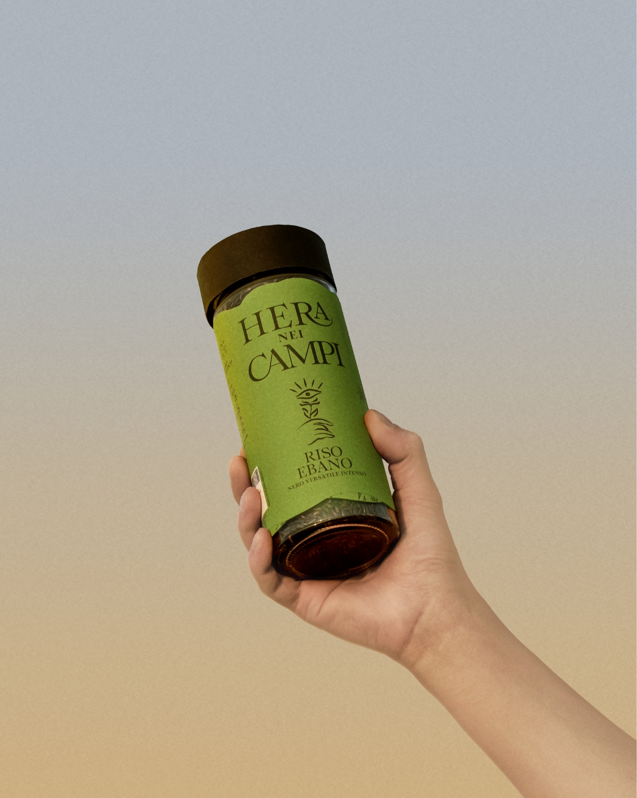
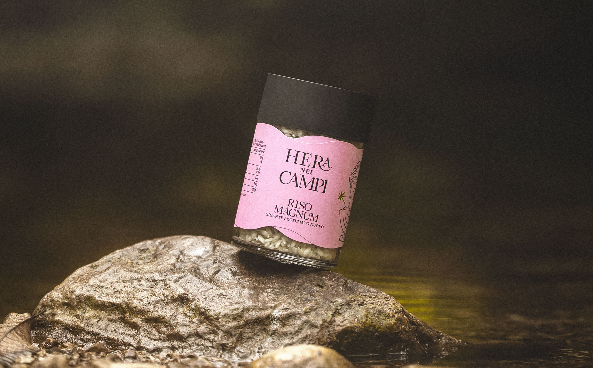
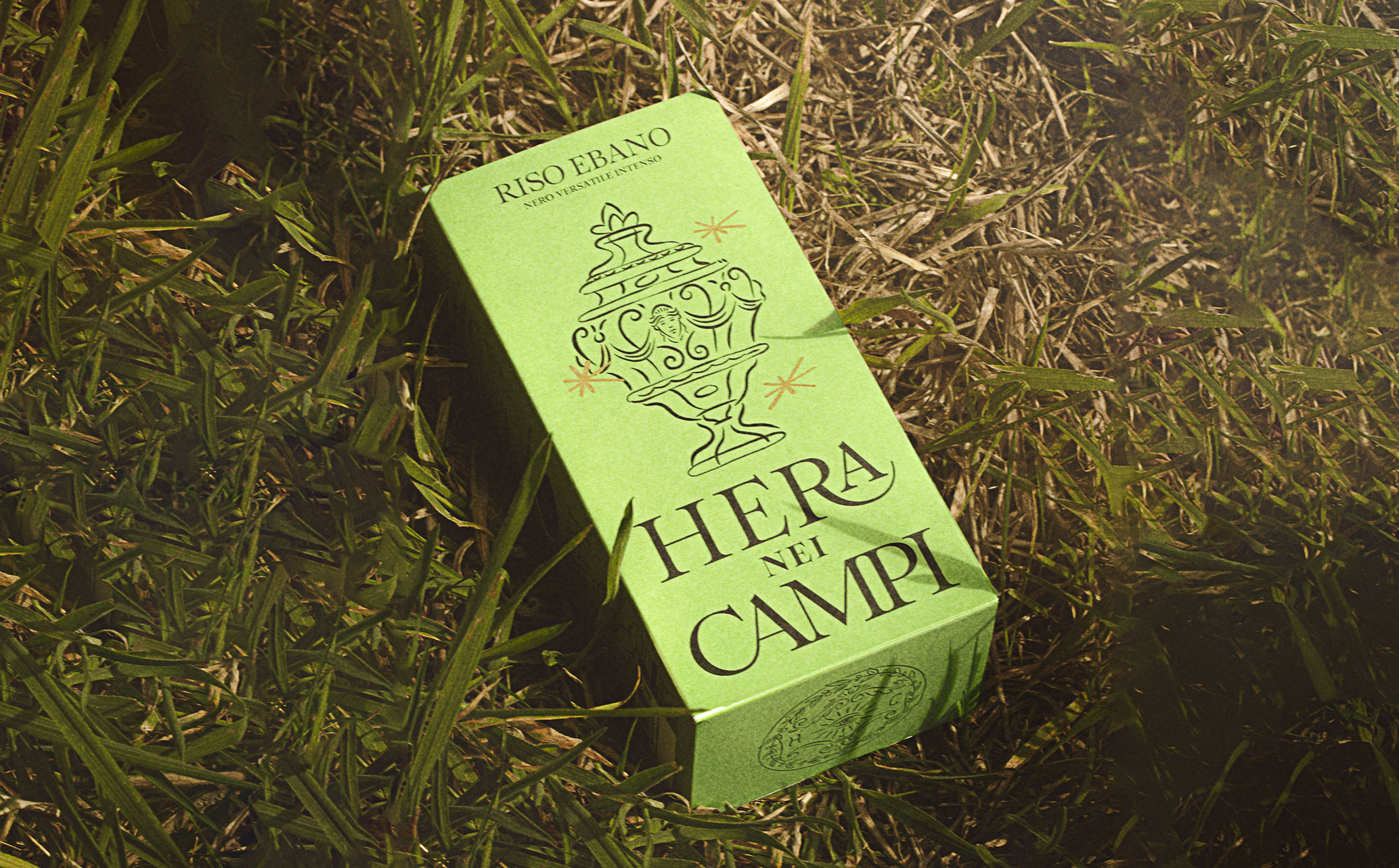
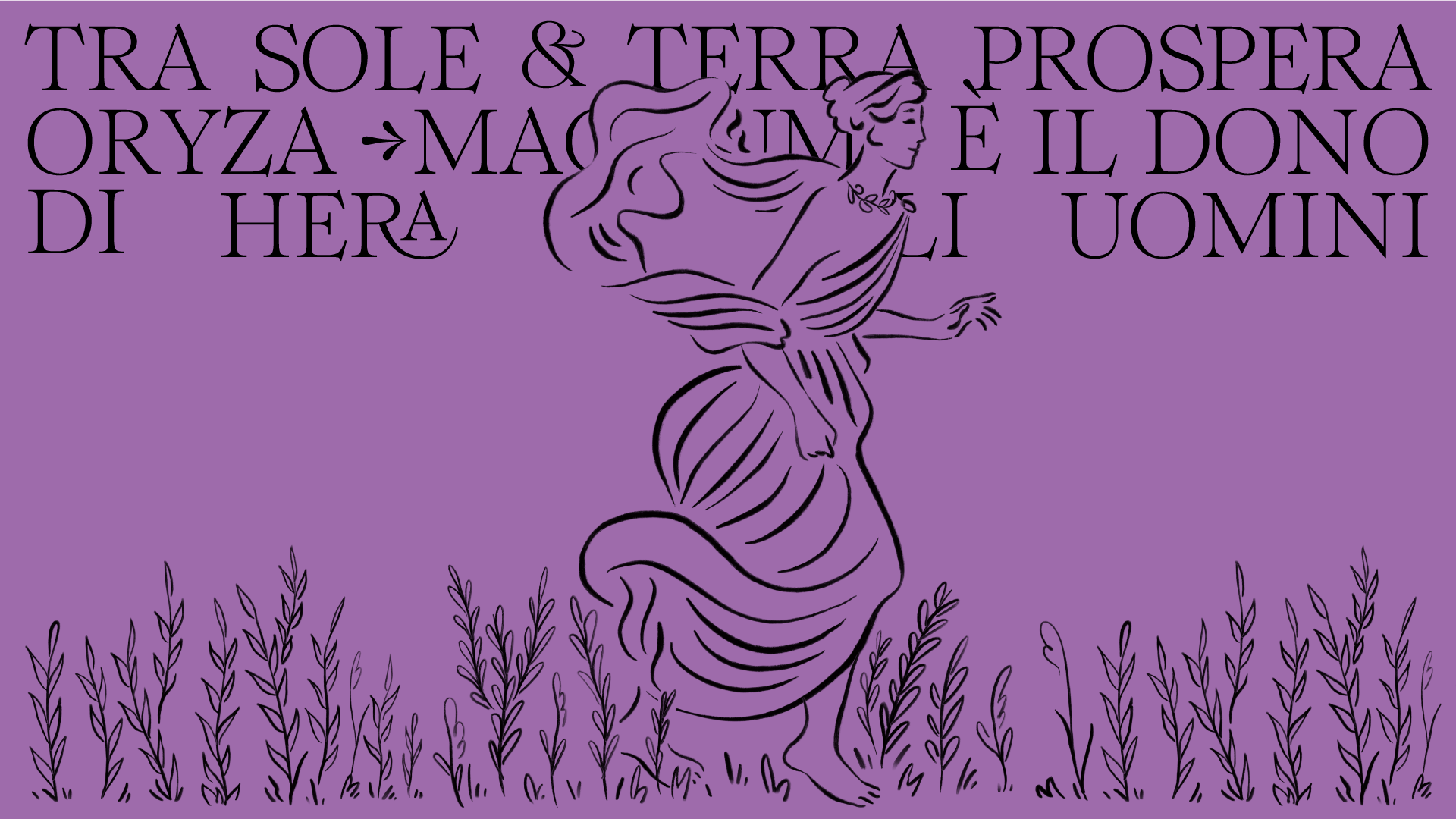
Hera nei Campi brings rice cultivation back to Southern Italy after 200 years. It does so with an unprecedented technological revolution and a new variety of rice: Magnum rice. For Hera nei Campi, we structured the brand design, created the labels, and three different packaging options – one for each type of rice – in two different sizes. The packaging concept is closely linked to the geographical area where the rice is cultivated, the Piana del Sele, one of the most productive regions in Southern Italy, located near the ancient city of Paestum, which is now home to a magnificent archaeological area rich in perfectly preserved Greek temples. The key in constructing the packaging is the interaction that the consumer must have with the box: by pressing in a certain spot, the box opens and reveals the jar with the rice. The packaging gives the user the idea of rediscovering the rice and the land from which it comes. Just as the amphora served to preserve and transport something unique and precious, the box also holds the jar to protect its contents. The label resembles the unrolling of a scroll. Along its 50 cm, one can read, among spontaneous illustrations and serif typography, the legend of Hera, the goddess of Olympus who descended among men and gifted them the seed of rice. The label is double-sided: on one side, the characteristics of the individual types of rice are illustrated, and on the other side, the brand's story is presented. The interaction with the user and the prototype design of the label do justice to the taste and unique characteristics of the product.
-
 First Place Packaging at Fedrigoni Top Awards 2025
 -
 Platinum in the Pentawards 2024
 -
 Shortlisted in the D&AD 2024
 -
 Silver in the Dieline Awards 2024
 -
 First Place Packaging in the One More Pack 2024
 - Mention Storytelling in the One More Pack 2024

Go up